Is the module responsive?
Since you are the one generating the block content, you can certainly create responsive elements that will adapt to different screen sizes.
However, this implies that you know a bit about CSS and HTML.
Here are some examples that may be useful to you.
Make an image responsive:
To make your images responsive, you must:
- Specify a width of 100%
- Specify a maximum width (corresponding to the maximum width your image should have)
Here is what the code might look like:
<img src="url-de-mon-im:age.jpg" style="max-width:300px;" width="100%" />
Make a video Responsive
You will find a tutorial here where I explain how to make your videos responsive.
Tutorial: making a video responsive
The tutorial is for the "Ajax Popup" module, but the principle is exactly the same.
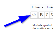
Important note: to modify the HTML code of your block content, you must use the "source code" view by clicking the corresponding icon.